Typography

Typography can help create clear hierarchies, organize information, and guide users through a product or experience.

We use the open-source typeface IBM Plex.

It can be accessed and downloaded from the Plex GitHub Repo

IBM PLEX
It has 3 font variations, Sans, Serif and Mono. Sans should be used for all our designs, avoid using Serif for designs, but it can be used for official letters, documentation, memos ...

Mono can be used when needed in software applications, but avoid using Mono in graphic design or presentations.
IBM Plex Sans
IBM Plex Serif
IBM Plex Mono
Font weight

IBM Plex has 6 weights, and they are: thin, light, normal, medium, semibold, bold

IBM Plex thin
IBM Plex light
IBM Plex normal
IBM Plex medium
IBM Plex semibold
IBM Plex bold
Pairings

It is important to maintain these type pairings. This allows for clarity, consistency, and a strong hierarchy for all communications.

Medium weight should be paired with Light weight, and Semi bold weight should be paired with normal weight.

MediumHeader
LightSubhead
SemiboldHeader
NormalSubhead
Hierarchy

It is important to organize typography in a hierarchical system according to relative importance or inclusiveness through scale and function depending on communication.

Awareness
LaneWare
Intelligent traffic solution
Information
Intelligent traffic solution
LaneWare
q-free.com
Action
Download
This headline is
in three lines and
set in medium
This subhead is ½ in size
of the headline and set in light
Headline
IBM Plex Sans Medium
Cap height = 1.5× base unit height
1.0/ 100% leading
0 tracking
6 words or more
Subhead
IBM Plex Sans Light
½ headline point size
1.1/110% leading
0 tracking
Logo
Logo height = base unit height (refer to grid setup section of this document)
A short and
bold headline
This subhead is ½ in size
of the headline and set in normal
Headline
IBM Plex Sans Bold
Cap height = 1.5× base unit height
1.0/ 100% leading
0 tracking
5 words or more
Subhead (optional)
IBM Plex Sans Normal
½ headline point size
1.1/110% leading
0 tracking
Logo (optional)
Logo height = base unit height (refer to grid setup section of this document)
This headline is
two lines long
This subhead is ½ in size
of the headline and set in normal
Lorem ipsum dolor sit amet, consectetur adipiscing elit. Vivamus nec finibus lorem. Sed porta sem purus, eget semper enim hendrerit eu. In sed diam vitae turpis finibus mollis. Morbi ut lectus vestibulum, porttitor urna consequat, ultricies odio.
Orci varius natoque penatibus et magnis dis parturient montes, nascetur ridiculus mus. Vivamus dignissim mollis efficitur. Duis eget nisi porta, imperdiet lorem et, porta nulla. Aenean porta libero non blandit eleifend. Quisque turpis est.
Headline
IBM Plex Sans Semibold
Cap height = 1.5× base unit height
1.0/ 100% leading
0 tracking
6 words or more
Subhead
IBM Plex Sans Normal
½ headline point size
1.1/110% leading
0 tracking
Subhead
IBM Plex Sans Normal
⅓ subhead point size
1.2/120% leading
0 tracking
Headline
Lorem ipsum dolor sit amet, consectetur adipiscing elit. Vivamus nec finibus lorem. Sed porta sem purus, eget semper enim hendrerit eu. In sed diam vitae turpis finibus mollis. Morbi ut lectus vesti.
Headline
IBM Plex Sans Semibold
3× body copy point size
1.0/ 100% leading
0 tracking
Body copy
IBM Plex Sans Normal
⅓ headline point size
1.2/120% leading
0 tracking
This is a headline
Lorem ipsum dolor sit amet, consectetur adipiscing elit. Vivamus nec finibus lorem. Sed porta sem purus, eget semper enim hendrerit eu. In sed diam vitae turpis finibus mollis. Morbi ut lectus vesti.
Headline
IBM Plex Sans Medium
2× body copy point size
1.0/ 100% leading
0 tracking
Body copy
IBM Plex Sans Light
½ headline size point size
1.2/120% leading
0 tracking
This is a section headline
Lorem ipsum dolor sit amet, consectetur adipiscing elit. Vivamus nec finibus lorem. Sed porta sem purus, eget semper enim hendrerit eu. In sed diam vitae turpis finibus mollis. Morbi ut lectus vesti.
Headline
IBM Plex Sans Normal
1× subhead point size
1.2/120% leading
0 tracking
Body copy
IBM Plex Sans Normal
1× subhead point size
1.2/120% leading
0 tracking
Imagery

Typography should either be black on light imagery or white on dark imagery.
Text must be easily readable when it is placed on top of an image.

If the text is not quite readable on the image, overlay the image with a gradient.

Split the surface, don't overlay, if possible.

Standalone image looks nicer, and they are more effective

Split the surface
Use black text
on light images
Use black text on light images
Use white text
on dark images
Use white text on dark images
Use gradients if the
text is not readable
Use gradient if text is not readable
Typography Guidance
Red
Yellow
Green
Blue
Purple
Pink
Do not use colored typography (black or white only)
DO NOT SHOUT
Do not use all caps in Headlines and Sub headlines
Tight tracking
Wide tracking
Do not adjust tracking or letter spacing
Bold
Bold
Bold Bold Bold Bold Bold Bold Bold Bold Bold Bold Bold Bold Bold Bold Bold Bold Bold Bold
Do not make different levels of hierarchy the same weight
This is the headline
This is the sub-head
This is body copy that is the same size as the header and sub-head.
Do not make any level of hierarchy the same size or scale as another
This is the headline
This is the sub-head
This is body copy that is the same size as the header and sub-head.
Do miss align the text or center it
Headline
Do not frame text with a background color
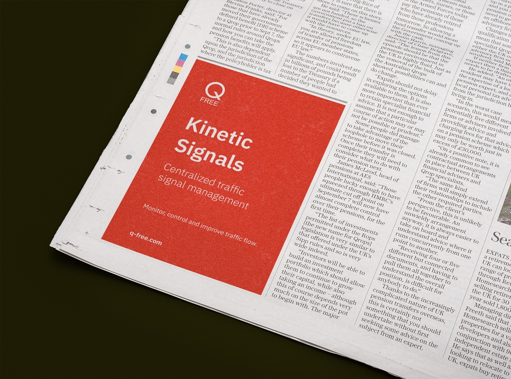
Design with typography examples
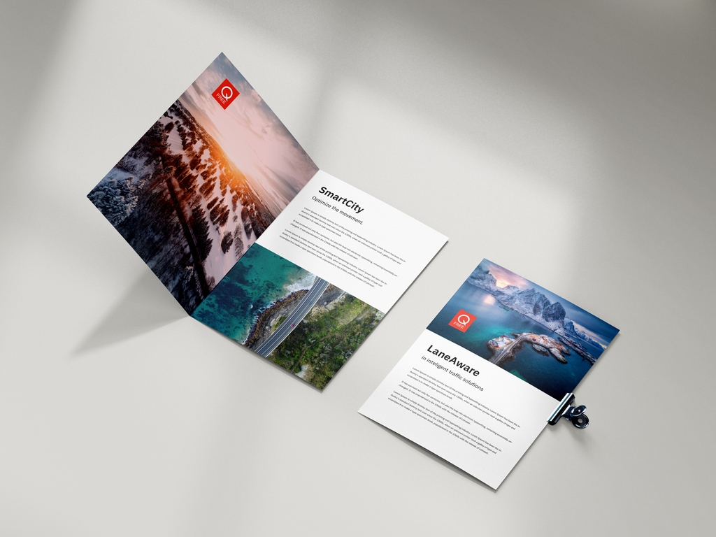
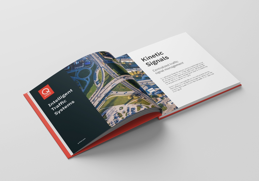
Book Mockup
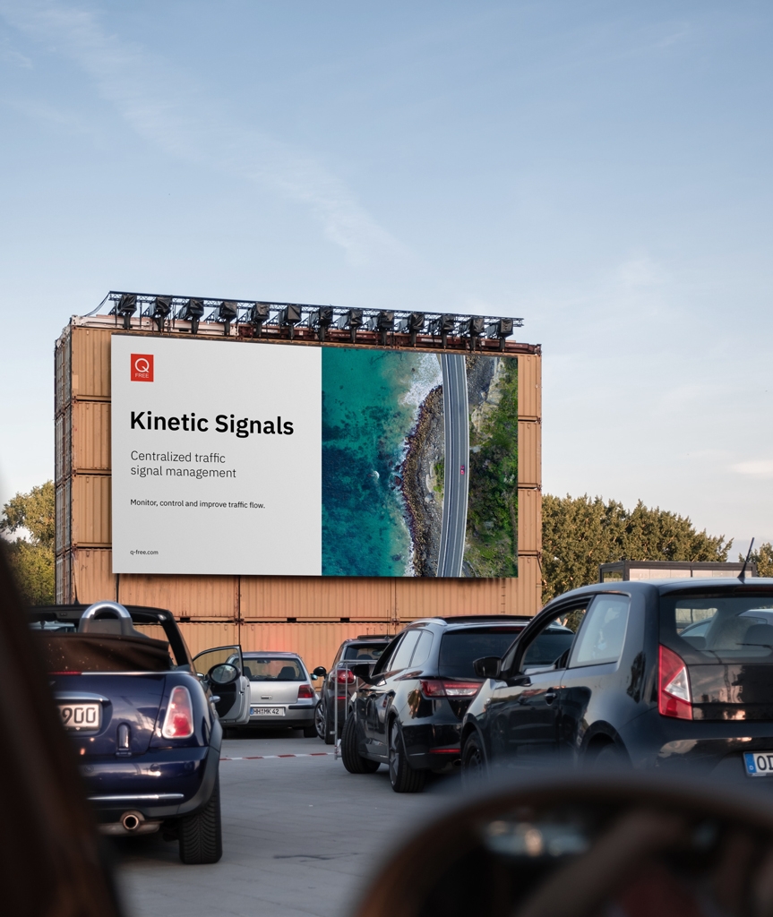
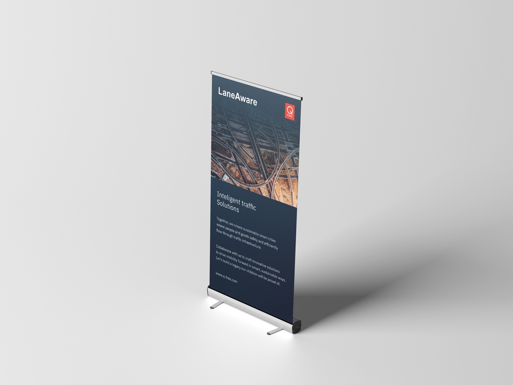
Q-free roll up example