Logo
Our logo consist of two main elements "Q" and the word "free".
Usually white on a red background. It is made from custom type.
It has clear defined white space, as well as delineated placement in relation to other content.
Usually white on a red background. It is made from custom type.
It has clear defined white space, as well as delineated placement in relation to other content.
Logo variations
Our logo has two main variations, the vertical and the horizontal.
Vertical variation
This is our main logo and the preferred variation. The logo proportions should always remain the same, no matter what the application and setting. In order to ensure the proper visual impact, the logo should always be surrounded by a buffer zone. The logo can be used in color or in a monotone version.
Horizontal variation
This horizontal variation can be used for headers of application and when the form suits the layout better. The logo variation can be used in color or in a monotone version.
Whitespace
When adding the logo in a layout where other elements are close by, whitespace around the logo should be minimal to the height of the 'F' letter taken from the FREE.
Whitespace exceptions
The logo placement depends on the type of communication and use.
Here are some exceptions.
Here are some exceptions.
Social Icons
App Icons
Color and scale
Our primary logo is white on red background. we also have a monochrome variation that is white on black background.
The logo can be displayed in a monotone version in two-color printed material.
Color versions of the logo are preferred if printing techniques allow.
Usage of backgrounds
In some cases, such as embroidering, a lighter logo is needed.
Versions of the logo without background, are preferred .
Versions of the logo without background, are preferred .
Scale
Our logo is designed to scale to small sizes on print and screen.
Smallest size should be 24 pixels in width.
Smallest size should be 24 pixels in width.
If the logo should be smaller then 24 px for example in the case of the favicon, you should use only the "Q" without the 'free', since its not readable.
Usage in the UI
Usage of Logo in applications should follow the guidelines above.
Also there are some exceptions, the maximum height of the logotype in the header or the sidebar should not exceed 80px.
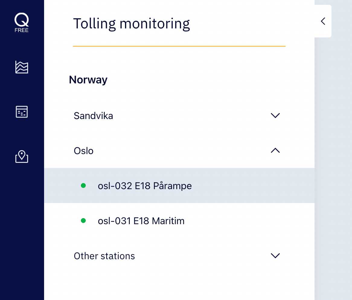
The logo can be added without the background, for example like in sidebar.
Also there are some exceptions, the maximum height of the logotype in the header or the sidebar should not exceed 80px.
The logo can be added without the background, for example like in sidebar.
Logo in applications sidebar menu.
Logo in web site header.
Logo Guidance
Do not rotate the logo
Don’t stretch or manipulate the logo.
Don’t pair the logo with shapes that may be confused as a part of the logo.
Use only our brand colors, red, black and white
Logo should have sharp edges not rounded
Don’t add a border around the logo
UK
Do not add graphics, insert words, or modify the design of the logo.
Do not put the logo on top of the busy background
Don’t use the "Q" from the logo as a graphic element of a design
Don't forget these important legal reminders:
- Do not use Q-Free as a verb (e.g. “Let’s Q-Free to the skies.”). Instead, use it as an adjective.
- Do not use Q-Free as a noun; "Q-Free will secure." Instead, consider using it as an adjective.
- Do not use Q-Free in plural or possessive form, e.g., Q-Free's,
Social Icons
App icons are individually designed based on specifications. They are an exception to the whitespace guidelines and are sized optically to best fit each shape.
Examples and application
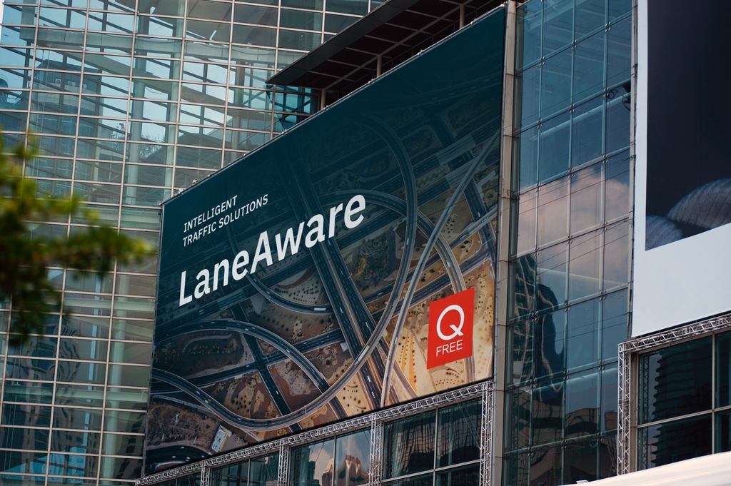
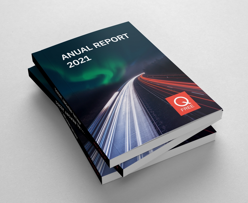
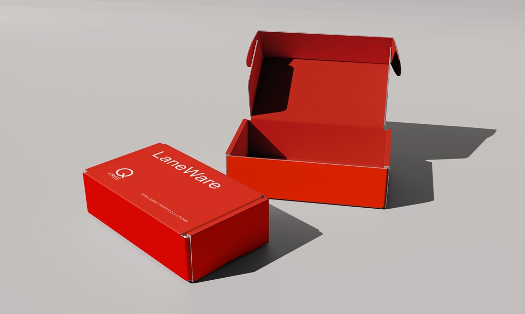
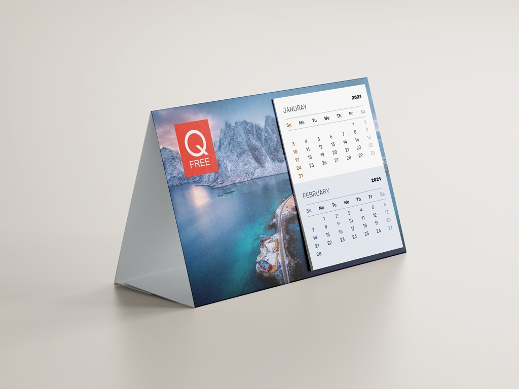
Here are some examples of a proper logo usage in design.
